library(tidyverse)
library(plotly)

library(dataRetrieval)
library(climateR)
library(terra)
library(exactextractr)

library(tidymodels)
library(tsibble)
library(feasts)
library(modeltime)
library(timetk)
library(tseries) # for stationarity testsLab 6: Timeseries Data
Using Modeltime to predict future streamflow on the Cache la Poudre River
Introduction
In this lab you will download streamflow data from the Cache la Poudre River (USGS site 06752260) and analyze it using the time series methods introduced in lecture. You will then use modeltime to predict future streamflow using both the time structure of the series and exogenous climate predictors.
This mirrors the Lees Ferry forecasting example from lecture — same dataRetrieval pipeline, same modeltime workflow, but now applied to a river you can see from campus. Like Lees Ferry, the Poudre is an operational water-supply system: Fort Collins, Loveland, and Greeley all depend on it, and the flows you forecast here directly inform how water managers plan deliveries.
Getting the Data
Streamflow
Download daily streamflow for the Poudre at Mouth (USGS 06752260) and aggregate to monthly means. This is the same readNWISdv() + renameNWISColumns() pipeline from Lab 1 — the only addition is yearmonth() from tsibble to create a monthly time index.
poudre_flow <- readNWISdv(
  siteNumber = "06752260",
  parameterCd = "00060",
  startDate   = "2013-01-01",
  endDate     = "2023-12-31"
) |>
  renameNWISColumns() |>
  mutate(Date = yearmonth(Date)) |>
  group_by(Date) |>
  summarise(Flow = mean(Flow))
Historic Climate (GridMET)
We will use climateR::getTerraClim() to download monthly climate data for the Poudre basin (max temperature, precipitation, solar radiation). The exactextractr package spatially averages each raster layer over the basin polygon.
basin <- findNLDI(nwis = "06752260", find = "basin")

sdate <- as.Date("2013-01-01")
edate <- as.Date("2023-12-31")

gm <- getTerraClim(
  AOI       = basin$basin,
  var       = c("tmax", "ppt", "srad"),
  startDate = sdate,
  endDate   = edate
) |>
  unlist() |>
  rast() |>
  exact_extract(basin$basin, "mean", progress = FALSE)

historic <- mutate(gm, id = "gridmet") |>
  pivot_longer(cols = -id) |>
  mutate(name = sub("^mean\\.", "", name)) |>
  tidyr::extract(name, into = c("var", "index"), "(.*)_([^_]+$)") |>
  mutate(index = as.integer(index)) |>
  mutate(Date = yearmonth(seq.Date(sdate, edate, by = "month")[as.numeric(index)])) |>
  pivot_wider(id_cols = Date, names_from = var, values_from = value) |>
  right_join(poudre_flow, by = "Date")

# Validate: should have 132 rows (11 years × 12 months). If fewer, climate data
# is missing for some months and those flow months were silently dropped.
stopifnot("Climate join dropped flow months — check GridMET download" = nrow(historic) == 132)
Future Climate (MACA)
Any time exogenous predictors are used for forecasting, future values of those predictors must also be available. We use MACA — a statistically downscaled climate dataset developed by the same group as GridMET — to get projected temperature, precipitation, and solar radiation through 2033.
Two differences from GridMET: temperature is in Kelvin (subtract 273.15 for °C) and variable names differ slightly.
sdate <- as.Date("2024-01-01")
edate <- as.Date("2033-12-31")

maca <- getMACA(
  AOI      = basin$basin,
  var      = c("tasmax", "pr", "rsds"),
  timeRes  = "month",
  startDate = sdate,
  endDate   = edate
) |>
  unlist() |>
  rast() |>
  exact_extract(basin$basin, "mean", progress = FALSE)

future <- mutate(maca, id = "maca") |>
  pivot_longer(cols = -id) |>
  mutate(name = sub("^mean\\.", "", name)) |>
  tidyr::extract(name, into = c("var", "index"), "(.*)_([^_]+$)") |>
  mutate(index = as.integer(index)) |>
  mutate(Date = yearmonth(seq.Date(sdate, edate, by = "month")[as.numeric(index)])) |>
  pivot_wider(id_cols = Date, names_from = var, values_from = value)

# Rename the 3 climate columns to match GridMET names (Date column stays first)
stopifnot("Unexpected MACA column count" = ncol(future) == 4)
names(future)[2:4] <- c("ppt", "srad", "tmax")  # order matches getMACA var request
future <- mutate(future, tmax = tmax - 273.15)   # Kelvin → °C
Your Turn
1. Convert to tsibble
Convert historic to a tsibble object using as_tsibble(). A tsibble is a tidy time series data frame — it retains the date index and integrates with feasts functions for decomposition and visualization. Think of it as a tibble that knows it is ordered in time.
pf <- as_tsibble(historic)Using `Date` as index variable.2. Plot the Time Series
Use ggplot to plot monthly Flow over time. Use plot_ly() from plotly for an interactive version — this lets you zoom into specific years or hover over values.
g1 <- ggplot(pf, aes(x = as.Date(Date), y = Flow)) +
  geom_line(color = "steelblue") +
  labs(title  = "Monthly Streamflow — Cache la Poudre at Mouth",
       y = "Flow (cfs)", x = NULL) +
  theme_minimal()

plot_ly(pf, x = ~as.Date(Date), y = ~Flow, type = "scatter", mode = "lines",
        line = list(color = "steelblue")) |>
  layout(title = "Monthly Streamflow — Cache la Poudre at Mouth",
         xaxis = list(title = "Date"),
         yaxis = list(title = "Flow (cfs)"))
3. Seasonal Diagnostics
Before fitting any model, inspect the seasonal structure using two complementary feasts plots.
Subseries plot — one panel per month, each line is one year, the blue line is the monthly mean across all years:
gg_subseries(pf, y = Flow) +
  labs(title = "Monthly Flow Patterns — Poudre at Mouth",
       y = "Flow (cfs)", x = "Year") +
  theme_minimal()
Warning: `gg_subseries()` was deprecated in feasts 0.4.2.
ℹ Please use `ggtime::gg_subseries()` instead.
ℹ Graphics functions have been moved to the {ggtime} package. Please use
`library(ggtime)` instead.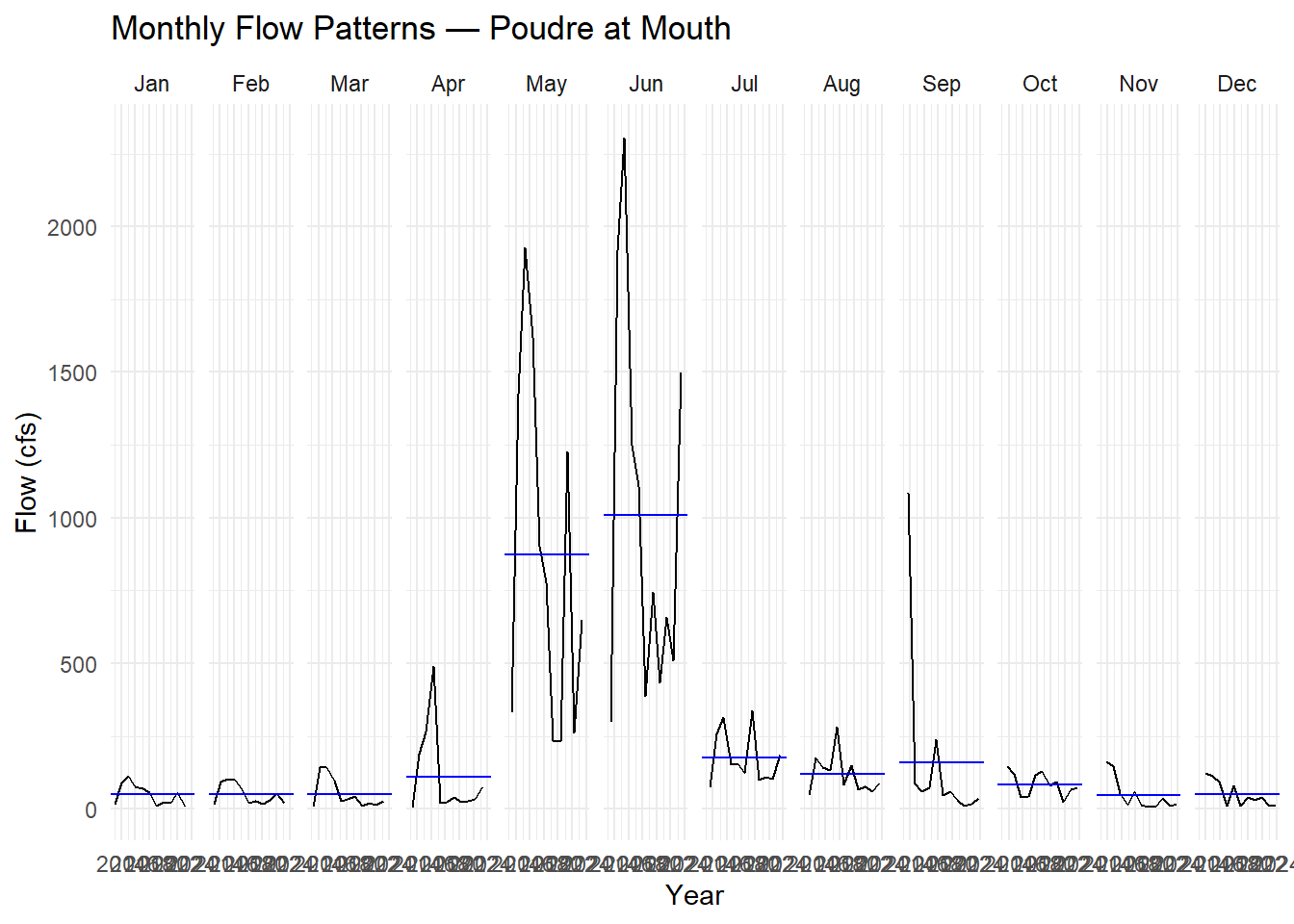
Seasonal plot — each line is one year plotted over the calendar cycle. Parallel lines = stable seasonal shape; diverging lines = changing pattern:
gg_season(pf, y = Flow) +
  labs(title = "Seasonal Shape by Year",
       y = "Flow (cfs)", x = "Month") +
  theme_minimal()
Warning: `gg_season()` was deprecated in feasts 0.4.2.
ℹ Please use `ggtime::gg_season()` instead.
ℹ Graphics functions have been moved to the {ggtime} package. Please use
`library(ggtime)` instead.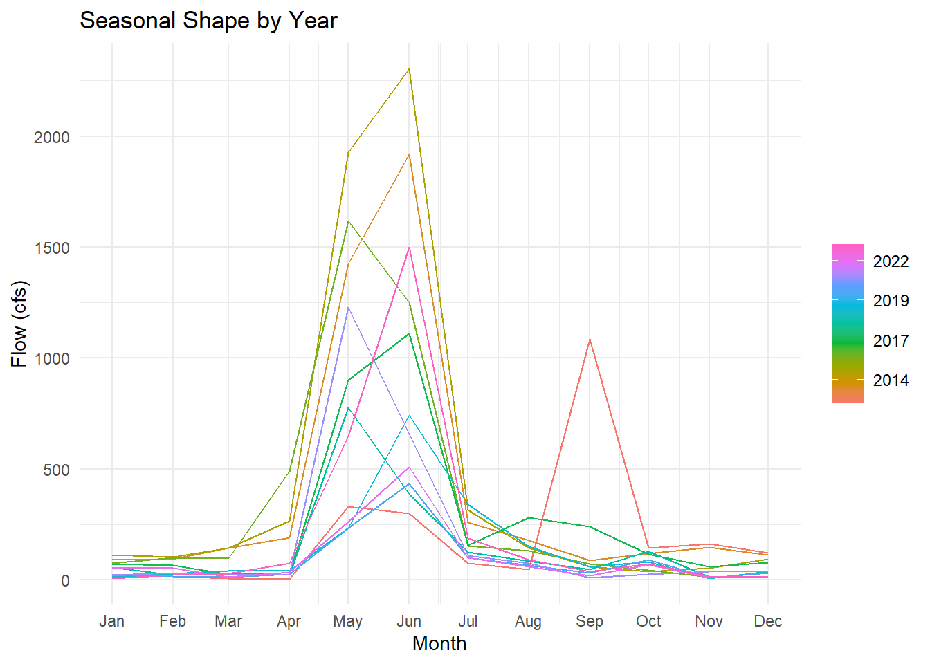
Describe what you see. How are “seasons” defined in these plots? Is the seasonal shape consistent across years, or does it change? What physical process drives the May–June peak?
In the subseries plot, each set shows a month. The horizontal lines show the monthly mean across all months. The plot shows individual months, but I think we could consider April, May, and June as spring months. The plot shows that spring (May and June) has the highest mean, with the mean of almost 1000 cfs and apeak of up to more than 2000 cfs. The seasonal trend is consistant over differnt years, except one year where there is a peak in September. The snowmelt happens in spring time during May and June which drives the peak for these months.
4. Stationarity and Autocorrelation
Two diagnostics that directly inform ARIMA model selection:
Lag plot — plots Flow against its own lagged values. Strong linear patterns = high autocorrelation (ARIMA has something to work with). A diffuse cloud = no memory. Use log1p(Flow) — on the raw scale, peak months compress all other observations into the corner and hide the structure.
pf |>
  mutate(log_flow = log1p(Flow)) |>
  gg_lag(y = log_flow, geom = "point") +
  labs(title = "Lag Structure of Monthly Poudre Flow (log scale)",
       x = "lag(log Flow, n)", y = "log Flow") +
  theme_minimal()
Warning: `gg_lag()` was deprecated in feasts 0.4.2.
ℹ Please use `ggtime::gg_lag()` instead.
ℹ Graphics functions have been moved to the {ggtime} package. Please use
`library(ggtime)` instead.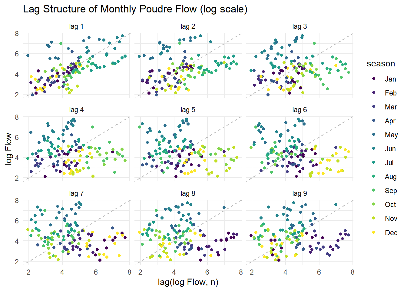
Stationarity tests — ARIMA requires a stationary series (constant mean and variance). Test formally before fitting:
# Test on log_flow — that's what ARIMA will actually model
log_flow_vec <- log1p(pf$Flow)

# ADF: H0 = non-stationary; p < 0.05 rejects non-stationarity → series IS stationary
adf.test(log_flow_vec)
Warning in adf.test(log_flow_vec): p-value smaller than printed p-value
    Augmented Dickey-Fuller Test

data:  log_flow_vec
Dickey-Fuller = -7.3292, Lag order = 5, p-value = 0.01
alternative hypothesis: stationary
# KPSS: H0 = stationary; p < 0.05 rejects stationarity → series is NOT stationary
kpss.test(log_flow_vec)
    KPSS Test for Level Stationarity

data:  log_flow_vec
KPSS Level = 0.50753, Truncation lag parameter = 4, p-value = 0.03997
What do the tests tell you? If the series is non-stationary, ARIMA will need d ≥ 1 (differencing). Does the lag plot support the same conclusion?
The adf test shows a significant p value, (p<0.05), which rejects the null hypothesis. This means that the series is stationary. The kpss test also shows a significant p value (p<0.05), which rejects the null hypothesis. This means series is not stationary.
The tests are opposite of each other, one says it is stationary one says it is non stationary. The lag supports the same conclusion as Arima with d≥1.
5. Decomposition
Use model(STL(...)) to decompose the time series into trend, seasonality, and remainder. Choose a trend window size you feel is appropriate and justify your choice. Extract components with components() and visualize with autoplot().
decomp <- pf |>
  model(STL(Flow ~ trend(window = 12) + season(window = "periodic"))) |>
  components()

autoplot(decomp)
Warning: `autoplot.dcmp_ts()` was deprecated in fabletools 0.6.0.
ℹ Please use `ggtime::autoplot.dcmp_ts()` instead.
ℹ Graphics functions have been moved to the {ggtime} package. Please use
`library(ggtime)` instead.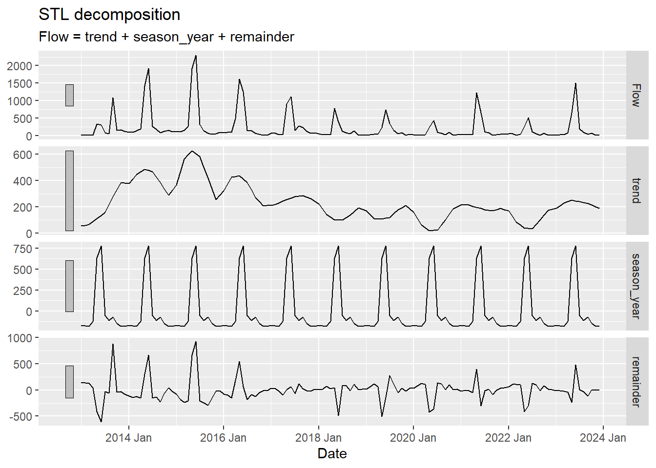
Describe what you see:
- What does the trend tell you about long-term changes in Poudre flow? Is there evidence of a decline consistent with climate change or upstream demand?
- What drives the seasonal component? (Hint: snowmelt, irrigation withdrawals, reservoir releases)
- Are there any spikes in the remainder that correspond to anomalous years you can identify?
The trend shows a decline in the flow from 2014 to 2024 . The trend is in line with the Colorado drought period worsening around 2018.
The seasonal component shows consistency, where there is higher flow in spring and a drop after that, which is driven by snowmelt.
There are large spikes in 2014 and 2016, which could be a sign of a climate event in those years, as it is not consistent through the years.
Modeltime Prediction
Data Preparation
Convert the historic tsibble and future tibble to plain tibbles with a Date column for modeltime. All predictor columns must be present in both the historic and future datasets — this is what enables the 10-year climate-driven forecast.
Streamflow is strictly non-negative but right-skewed — snowmelt peaks dwarf base-flow months. To prevent models from predicting negative flows, add a log-transformed response with log1p(Flow) (log(Flow + 1), safe when flow is near zero). Fit all models on log_flow; back-transform predictions with expm1() (= exp(x) - 1) to return to cfs units.
pf_tbl <- pf |>
  as_tibble() |>
  mutate(date     = as.Date(Date),
         log_flow = log1p(Flow),
         Date     = NULL)

future_tbl <- future |>
  as_tibble() |>
  mutate(date = as.Date(Date), Date = NULL)
Train / Test Split
Hold out the last 24 months (2022–2023) as the test set. This mirrors the assess = "60 months" logic from the CO₂ and Lees Ferry examples — the test set is always the most recent data, never a random sample.
# Note: time_series_split() is deterministic — it always cuts at the same point
# regardless of the seed. set.seed() is kept here as a tidymodels convention
# (some resampling functions are random), but removing it gives identical results.
set.seed(10291991)
splits <- time_series_split(pf_tbl, assess = "24 months", cumulative = TRUE)
Using date_var: datetraining <- training(splits)
testing <- testing(splits)Model Definition
Choose at least three models — one ARIMA and one Prophet are required. Store model specifications in a list:
mods <- list(
  # Classical seasonal ARIMA — relies on stationarity (check your tests above)
  arima_reg() |> set_engine("auto_arima"),

  # ARIMA + XGBoost residual boosting — picks up nonlinear climate relationships
  arima_boost() |> set_engine("auto_arima_xgboost"),

  # Prophet — handles trend breaks, missing data, and multiple seasonalities
  prophet_reg() |> set_engine("prophet"),

  # Prophet + XGBoost — as above, but boosts on residuals
  prophet_boost() |> set_engine("prophet_xgboost"),

  # Exponential smoothing — strong baseline for multiplicative seasonal data
  exp_smoothing() |> set_engine("ets"),

  # MARS — nonparametric spline model, useful for nonlinear climate response
  mars(mode = "regression") |> set_engine("earth")
)
Model Fitting
Fit all models to the training data on the log scale. Exclude the raw Flow column so models only see log_flow as the response — each engine handles date and climate predictors internally.
models <- map(mods, ~ fit(.x, log_flow ~ ., data = select(training, -Flow)))frequency = 12 observations per 1 year
frequency = 12 observations per 1 yearDisabling weekly seasonality. Run prophet with weekly.seasonality=TRUE to override this.Disabling daily seasonality. Run prophet with daily.seasonality=TRUE to override this.Disabling weekly seasonality. Run prophet with weekly.seasonality=TRUE to override this.Disabling daily seasonality. Run prophet with daily.seasonality=TRUE to override this.frequency = 12 observations per 1 year
Attaching package: 'plotrix'The following object is masked from 'package:scales':
rescaleThe following object is masked from 'package:terra':
rescale(models_tbl <- as_modeltime_table(models))# Modeltime Table
# A tibble: 6 × 3
.model_id .model .model_desc
<int> <list> <chr>
1 1 <fit[+]> REGRESSION WITH ARIMA(3,1,0)(2,0,0)[12] ERRORS
2 2 <fit[+]> ARIMA(1,0,1)(0,1,1)[12] W/ XGBOOST ERRORS
3 3 <fit[+]> PROPHET W/ REGRESSORS
4 4 <fit[+]> PROPHET W/ XGBOOST ERRORS
5 5 <fit[+]> ETS(A,N,A)
6 6 <fit[+]> EARTH Calibration and Accuracy
Calibrate on the test set (2022–2023) to compute out-of-sample accuracy metrics. Pass select(testing, -Flow) so calibration uses the log-scale response:
calibration_table <- modeltime_calibrate(models_tbl, select(testing, -Flow), quiet = FALSE)

modeltime_accuracy(calibration_table) |>
  arrange(mae) |>
  select(.model_desc, mae, mape, mase, rmse, rsq)
# A tibble: 6 × 6
.model_desc mae mape mase rmse rsq
<chr> <dbl> <dbl> <dbl> <dbl> <dbl>
1 EARTH 0.448 13.3 0.454 0.534 0.849
2 ETS(A,N,A) 0.511 15.7 0.518 0.621 0.820
3 ARIMA(1,0,1)(0,1,1)[12] W/ XGBOOST ERRORS 0.562 17.7 0.569 0.720 0.730
4 PROPHET W/ REGRESSORS 0.580 16.0 0.588 0.691 0.783
5 REGRESSION WITH ARIMA(3,1,0)(2,0,0)[12] ERRORS 0.581 15.4 0.589 0.684 0.773
6 PROPHET W/ XGBOOST ERRORS 0.727 19.4 0.737 0.802 0.742Describe what you see. Use these benchmarks to interpret the numbers:
- MASE < 1 — the model beats a naïve seasonal forecast (last year’s same month)
- MAPE — intuitive % error, but inflated in low-flow months when Flow ≈ 0
- RMSE — penalizes large errors heavily; compare to mean test-period flow for context
- Do boosted models (ARIMA-boost, Prophet-boost) outperform their base versions? If so, the nonlinear climate signal is worth capturing.
The mase for all the models are lower than 1 which means that they all beat the naive seasonal forecast. EARTH model is the lowest (0.448), so this means that this model is the best one. For MAPE, the values are between 13% and 19%, but they are inflated when flow is low or almost 0. Again EARTH model has the lost error, so it is the best one. RMSE in EARTH model is lowest (0.53).
The boosted model (arima boost) outperformes the base arima. The prophet boost is worse than prophet.
Test Set Forecast
Forecast over the held-out test period and compare predictions to actuals. Back-transform with expm1() to return predictions to cfs. Two details matter: (1) expm1(x) is the exact inverse of log1p(x) and always returns values ≥ 0; (2) confidence interval lower bounds on the log scale can be slightly negative — floor them at 0 with pmax(.conf_lo, 0) before back-transforming so the ribbon never dips below zero cfs:
test_forecast <- calibration_table |>
  modeltime_forecast(new_data = select(testing, -Flow), actual_data = pf_tbl) |>
  mutate(.value   = expm1(.value),
         .conf_lo = expm1(pmax(.conf_lo, 0)),
         .conf_hi = expm1(.conf_hi))

test_forecast |>
  filter(.key == "actual") |>
  ggplot(aes(x = .index, y = .value)) +
  geom_line(color = "grey40") +
  geom_line(data = filter(test_forecast, .key == "prediction"),
            aes(color = .model_desc)) +
  geom_ribbon(data = filter(test_forecast, .key == "prediction"),
              aes(ymin = .conf_lo, ymax = .conf_hi, fill = .model_desc),
              alpha = 0.1) +
  scale_color_brewer(palette = "Set1") +
  scale_fill_brewer(palette = "Set1") +
  labs(title  = "Test Set Forecast vs Actuals — Poudre at Mouth",
       x = NULL, y = "Flow (cfs)", color = "Model", fill = "Model") +
  theme_minimal() +
  theme(legend.position = "bottom")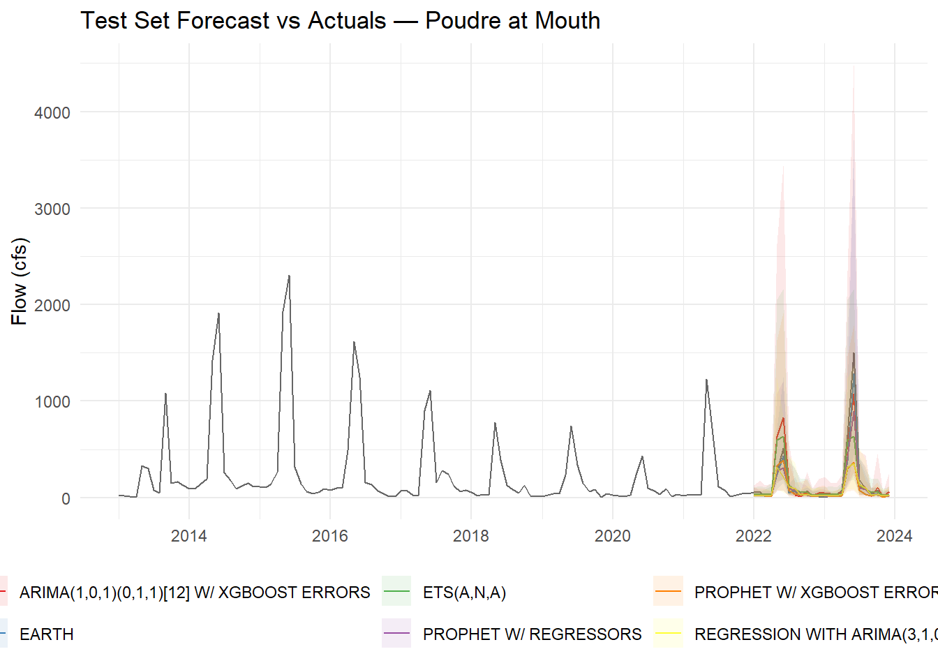
Do predictions track actuals during the 2022–2023 test window? Are confidence intervals capturing observed values? Note any discontinuities at the 2022 boundary between training and test.
The models capture the seasonality well. However there is a peak in 2022 and 2024 which shows that models might not have been successful in the predictions in this part.
Refit to Full Dataset
Refit all models to the complete 2013–2023 record before forecasting forward. Refitting allows auto-tuned models (auto.arima, ets) to re-optimize their parameters with more data:
refit_tbl <- modeltime_refit(calibration_table, data = select(pf_tbl, -Flow))frequency = 12 observations per 1 year
frequency = 12 observations per 1 yearDisabling weekly seasonality. Run prophet with weekly.seasonality=TRUE to override this.Disabling daily seasonality. Run prophet with daily.seasonality=TRUE to override this.Disabling weekly seasonality. Run prophet with weekly.seasonality=TRUE to override this.Disabling daily seasonality. Run prophet with daily.seasonality=TRUE to override this.frequency = 12 observations per 1 yearmodeltime_accuracy(refit_tbl) |>
arrange(mae) |>
select(.model_desc, mae, mape, mase, rmse, rsq)# A tibble: 6 × 6
.model_desc mae mape mase rmse rsq
<chr> <dbl> <dbl> <dbl> <dbl> <dbl>
1 EARTH 0.448 13.3 0.454 0.534 0.849
2 ETS(A,N,A) 0.511 15.7 0.518 0.621 0.820
3 UPDATE: ARIMA(1,0,0)(0,1,1)[12] WITH DRIFT W/ X… 0.562 17.7 0.569 0.720 0.730
4 PROPHET W/ REGRESSORS 0.580 16.0 0.588 0.691 0.783
5 REGRESSION WITH ARIMA(3,1,0)(2,0,0)[12] ERRORS 0.581 15.4 0.589 0.684 0.773
6 PROPHET W/ XGBOOST ERRORS 0.727 19.4 0.737 0.802 0.742Do the accuracy metrics change after refitting? Why or why not?
No they did not change, they are the same as before. This is because refitting updates the model for future predictions and does not calibrate past tests.
Forecast into the Future (2024–2033)
Use the refitted models with future_tbl as new_data to generate a 10-year climate-conditioned forecast. Back-transform with expm1():
future_forecast <- refit_tbl |>
  modeltime_forecast(new_data = future_tbl, actual_data = pf_tbl) |>
  mutate(.value   = expm1(.value),
         .conf_lo = expm1(pmax(.conf_lo, 0)),
         .conf_hi = expm1(.conf_hi))
Error: Problem occurred during prediction. Error in setup_dataframe(object,
df): Unable to parse date format in column ds. Convert to date format (%Y-%m-%d
or %Y-%m-%d %H:%M:%S) and check that there are no NAs.
Error: Problem occurred during prediction. Error in setup_dataframe(object,
df): Unable to parse date format in column ds. Convert to date format (%Y-%m-%d
or %Y-%m-%d %H:%M:%S) and check that there are no NAs.future_forecast |>
filter(.key == "actual") |>
ggplot(aes(x = .index, y = .value)) +
geom_line(color = "grey40") +
geom_line(data = filter(future_forecast, .key == "prediction"),
aes(color = .model_desc)) +
geom_ribbon(data = filter(future_forecast, .key == "prediction"),
aes(ymin = .conf_lo, ymax = .conf_hi, fill = .model_desc),
alpha = 0.1) +
scale_color_brewer(palette = "Set1") +
scale_fill_brewer(palette = "Set1") +
labs(title = "10-Year Forecast — Poudre at Mouth (2024–2033)",
x = NULL, y = "Flow (cfs)", color = "Model", fill = "Model") +
theme_minimal() +
theme(legend.position = "bottom")Warning: Removed 4 rows containing missing values or values outside the scale range
(`geom_line()`).Warning: Removed 4 rows containing missing values or values outside the scale range
(`geom_ribbon()`).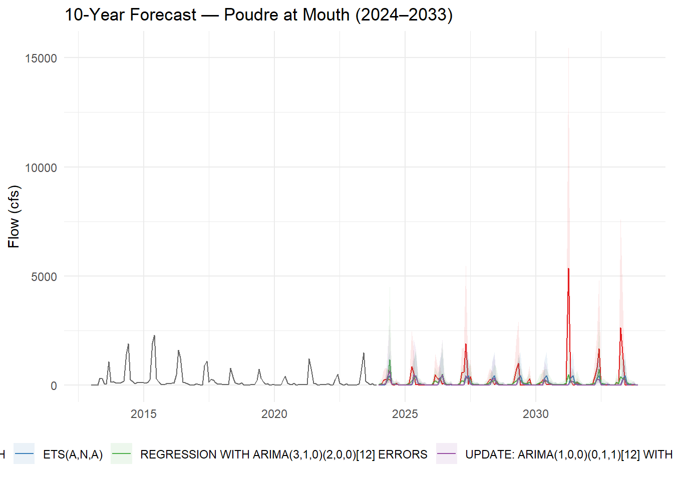
Wrap-up
Examine your 10-year forecast and reflect on the following:
- Model agreement: Do ARIMA and Prophet project similar trajectories? If they diverge, what does that tell you about their different assumptions (statistical stationarity vs. flexible trend)?
Yes, the both models show the flow trend but with differences in assumptions. arima assumes the series is stationary, while prophet follows non stationary assumption. arima depends mostly on the past mean to predict the future, while prophet uses the recent trajectory for predictions.
- Forecast quality: Which model would you recommend to CWCB for water-supply planning? Justify with your accuracy metrics.
I would recommend EARTH model which outperformed all the other models with the lowest error and mase. (mase= 0.45, rmse= 0.53) It captures nonlinear relationships which arima was not able to capture.
- Negative predictions: If any model predicts negative flow, explain why this happens and what you would do to fix it in a production context (hint: log-transformation of Flow before modeling).
no model showed negative flow because we used log1p. If model was fit on the raw flow data, we could have seen negative values, and we need to transform it.
- Regressor value: The MACA climate projections assume a specific emissions scenario. How does uncertainty in those projections propagate into your streamflow forecast?
The uncertainty is in the emission scenario path, as there are multiple scenarios for the future depending on how we will go about our current emissions. Each scenario will have different precipitation and flow pattern depending on the temperature changes. The other uncertainty is about the climate model itself, which predicts different temperature and precipitation under the same scenarios. These uncertainities are not captured in my streamflow prediction.
- Improvement path: What information not in
tmax,ppt,sradwould most improve this forecast? (Consider: snowpack, upstream storage, irrigation demand.)
I think other factors like snowpack, soil moisture, reservoir storage will be good indicators to be added to the model to improve the forecasts.
At this stage you have a working end-to-end time series forecasting pipeline — the same structural approach used by CWCB, USBR, and state water agencies for operational planning. The processes you learned in tidymodels apply directly here, and you can extend this framework with cross-validation (time_series_cv()), feature engineering (lag variables, rolling means), and hyperparameter tuning.
Going Further (Optional): Add an Upstream Regressor
In lecture we showed that adding Glenwood Springs flow as an exogenous regressor improved Lees Ferry forecasts because upstream conditions carry physical information the model can’t infer from time structure alone. Try the same approach here.
Download data from a headwater gage on the Poudre (e.g., North Fork Cache la Poudre, USGS 06746095) and add it as a predictor:
upstream <- readNWISdv(
  siteNumber  = "06746095",
  parameterCd = "00060",
  startDate   = "2013-01-01",
  endDate     = "2023-12-31"
) |>
  renameNWISColumns() |>
  # floor_date returns the 1st of each month as a Date — same type as pf_tbl$date
  mutate(date = floor_date(Date, "month")) |>
  group_by(date) |>
  summarise(upstream_flow = mean(Flow, na.rm = TRUE), .groups = "drop")

pf_reg <- pf_tbl |>
  left_join(upstream, by = "date") |>
  drop_na(upstream_flow)

splits_reg <- time_series_split(pf_reg, assess = "24 months", cumulative = TRUE)

# Use log_flow ~ . consistent with the main pipeline; exclude raw Flow
models_reg <- map(mods, ~ fit(.x, log_flow ~ .,
                               data = select(training(splits_reg), -Flow)))
Does adding upstream flow improve MASE on the test set? If yes, the physical signal is worth including. If not, the climate data alone may be sufficient for monthly aggregation at this timescale.